In recent years, when I move through an airport, a museum, a hotel lobby or a newly built residential compound, I feel as though someone has quietly lowered the saturation of the world. The walls are beige. The sofas hover between sand and stone. The floors are pale oak. The art, if present, is carefully calibrated not to disturb the palette. Even the light feels filtered, softened, disciplined.
Nothing is wrong. Everything is tasteful. Everything is curated. And yet I leave with a subtle discomfort, as though something essential has been gently erased.
I ask myself, again and again: Where are the colors?
Not in the literal sense, of course, pigments still exist, digital palettes are infinite, fashion houses can produce every shade imaginable, yet in our appetite for them, in our tolerance for them, in our daily willingness to live among them, colors seem to have gone.
As a painter, this question is not abstract. It touches my practice, my psychology and my sense of cultural direction. I work with skies that fracture into ultramarine, with birds that carry gold and indigo across luminous atmospheres. When I paint, I do not “add” color; I enter into dialogue with it. I negotiate with its intensity and allow it to come to life. And increasingly, I feel as though I am swimming against a current of desaturation.
Modern humanity, as it becomes more crowded, more digitized, more saturated with empty information and disinformation alike, seems to be disciplining color out of its physical environment. We scroll through hyper-saturated screens for hours, bombarded by headlines, crises, opinions and algorithms competing for attention. Then we return home to beige walls, grey textiles, white kitchens. It is as if we are exacting revenge on color for the chaos inside our minds.
But is color truly the source of that chaos? Or are we confusing intensity with noise?
Minimalism did not begin as a lifestyle template. It began as a philosophical inquiry. Early abstract painters and later minimalists were not eliminating color because they feared it. They were interrogating the essence of perception. When modern art reduced form, simplified composition or explored monochrome canvases, it did so to concentrate experience, not to flatten it.
Yet over time, philosophical reduction became an aesthetic fashion. The white wall ceased to be an existential statement and became a real estate strategy. The beige sofa stopped being a spatial contemplation and became market insurance. Neutrality began to signify sophistication, control and universality.
Architecture across global cities now speaks a similar language: glass, concrete, pale stone, muted interiors. Luxury developments in Doha, Istanbul, London or New York differ less in chromatic character than in price per square meter. Neutrality travels well. It offends no one. It translates across cultures and as part of today’s people life style: photographs elegantly. On the other hand, it also erases specificity. Color once marked geography. Terracotta facades under Mediterranean sun, cobalt doors in North Africa, Ottoman tiles shimmering in blue, Latin American streets erupting in saturated pinks and yellows, these were not decorative excesses but cultural signatures. Today, international taste often smooths such distinctions into globally palatable palettes.
In interior design, the language of calm has merged with the language of control. We are told to declutter, simplify, neutralize. Pale oak shelving, cream upholstery and gray marble are presented as antidotes to overstimulation. And perhaps they are, to a degree. The contemporary mind is undeniably overloaded. We consume more information daily than previous generations did in months. Our cognitive bandwidth is stretched thin by notifications, misinformation and urgency.
In response, we curate silence. Yet silence and muting are not identical. A space can be serene without being stripped of chromatic vitality. A single deep blue wall can calm as effectively as a white one. A saturated textile can anchor memory without disturbing order. Neutrality becomes problematic not when chosen deliberately, but when adopted reflexively, when it becomes the default setting of culture.
Fashion reveals a similar shift. The rise of the capsule wardrobe, the dominance of all-black ensembles and the beige-on-beige aesthetic, these choices signal discipline and refinement. Monochrome dressing reduces decision fatigue. It aligns with minimalist interiors. It conveys a kind of intellectual seriousness.
But clothing is not merely fabric. It is psychological architecture. When we wrap ourselves in a narrow chromatic range day after day, we may be internalizing a subtle message: stay contained, controlled and unreadable.
Color exposes preference. It declares taste, risks misunderstanding. Neutrality, in contrast, protects. And in an era defined by surveillance, branding, and perpetual self-presentation, protection is seductive.
Even our relationship with food has not escaped this aesthetic discipline. Under the banner of “clean eating,” we increasingly encounter monochromatic plates, beige protein bowls, pale smoothies, carefully muted compositions arranged with moral precision. Of course, nourishment itself is not colorless. Nature offers abundance in crimson, emerald, saffron and violet. Yet the marketed visual language of wellness often mirrors the architecture of neutrality: restrained, symmetrical, desaturated. When even our meals begin to conform to a palette of control, one cannot help but wonder whether we are simplifying nourishment or aestheticizing restraint as virtue.
The modern human lives inside a continuous stream of stimuli. Our screens flash with hyper-saturated images designed to capture attention. Advertisements amplify reds and yellows to provoke appetite. News outlets intensify graphics to convey urgency. Social media algorithms reward contrast and immediacy. We are visually assaulted by color in the digital realm.
Perhaps the beige living room, the monochrome wardrobe and the muted cafe interior represent an unconscious counterbalance. If the virtual world screams in neon, the physical world whispers in sand and stone. But here lies the paradox: Color itself is not noise. Random, manipulative, meaningless information is noise. Deception is noise. Algorithmic outrage is noise. Color, when intentional, is coherence. It can be contemplative, even spiritual. By disciplining color out of our tangible environments, we may be misidentifying the problem. We are fatigued not by chromatic richness but by informational excess. Yet instead of limiting the data stream, we limit the palette of our homes.
There is another dimension to this desaturation: control. In a world where geopolitical tensions, economic fluctuations and digital narratives exceed our influence, the neutral interior offers mastery. We cannot govern global instability, but we can choose beige curtains. We cannot silence misinformation, but we can silence our walls.
Minimalism promises clarity. It promises that by reducing the visual field, we reduce anxiety. And indeed, there is relief in order. However, order achieved through uniformity may carry a hidden cost: emotional flattening.
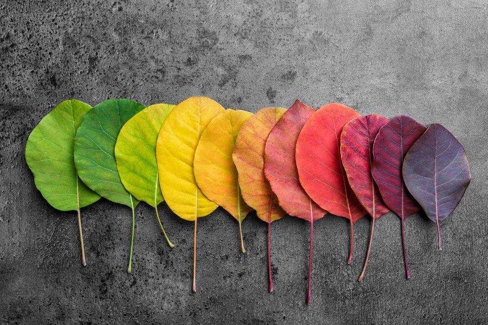
Color stimulates memory and embodied response. A vivid yellow might evoke childhood kitchens. A saturated blue might recall coastal horizons. Deep emerald might resonate with sacred architecture. When our environments hover perpetually in muted gradients, these associations diminish.
I often wonder what happens when entire generations grow up surrounded predominantly by desaturated spaces.
Does their tolerance for emotional intensity shift?
Does their visual imagination recalibrate toward restraint?
If children encounter color primarily through screens rather than through architecture, textiles and public space, their relationship to chromatic experience becomes mediated and disembodied. The physical world grows quiet; the digital world grows louder. This imbalance is not neutral. It shapes perception.
In my own studio, color is not negotiable. It is not an accessory. It is infrastructure. When I work on my peace compositions, the sky is never a blank backdrop. It is a field of movement, turquoise dissolving into indigo, gold catching light, white functioning as breath rather than emptiness.
Peace, to me, is not pale withdrawal. It is a vibrant equilibrium. It is intensity without violence.
If I were to render my birds against a uniformly beige atmosphere, something essential would collapse. Their flight depends on chromatic dialogue. Their presence requires luminosity. Gold does not whisper. It insists. Ultramarine does not apologize. It expands.
There are days when I spend extended time in hyper-neutral environments and feel a physical urge to paint. My hands reach instinctively for saturated pigments. It is almost physiological, as though my system requires chromatic oxygen. The act of mixing colors becomes restorative, a rebalancing against cultural greyness.
This is not an argument against minimalism. I respect reduction when it emerges from conceptual clarity. A restrained composition can be profoundly moving. A limited palette can achieve extraordinary depth. The danger lies not in white walls but in unquestioned conformity.
Minimalism did not begin as a lifestyle template nor as a real estate strategy. Its roots were intellectual, even metaphysical. When Kazimir Malevich reduced painting to the radical austerity of the Black Square, he was not advocating decorative emptiness. He was proposing a rupture with illusion and an inquiry into pure perception. When Yves Klein immersed the viewer in International Klein Blue, he was not escaping color but intensifying it, compressing the universe into a single chromatic field charged with transcendence. And perhaps most tellingly, when Mark Rothko dissolved figuration into vast planes of trembling pigment, he did not strip painting of color. He made color itself the site of existential encounter. Rothko’s canvases are often described as “minimal,” yet anyone who has stood before one knows that they are not neutral. They pulse. They breathe. They vibrate at the edge of grief and revelation. The minimalism of these artists was never about flattening emotion. It was about distilling it.
What concerns me today is not minimalism as philosophy, but minimalism as default culture. The white wall is no longer a metaphysical statement. It is a resale guarantee. The beige sofa is not a meditation on form. It is a safe investment. In this translation from radical inquiry to lifestyle uniformity, color becomes diluted not conceptually, but commercially.
As an artist who writes weekly, who observes global art ecosystems and architectural trends, I sense that neutrality has become synonymous with sophistication. Beige equals elegance. Grey equals maturity. Monochrome equals intelligence. But sophistication need not demand desaturation. Emotional maturity does not require chromatic retreat.
There is a subtle courage in color. To paint a wall deep blue in a sea of white is to declare a preference. To wear emerald among charcoal suits is to accept visibility. To design architecture that embraces regional tones rather than global beige is to affirm identity. Neutrality conceals; color reveals.
And perhaps, in an era defined by cautious self-editing online and offline, we gravitate toward concealment.
Are we losing colors? Not materially. Pigments are abundant. Fashion cycles will inevitably rediscover saturation. Designers will rebel against monotony, as history repeatedly demonstrates. But we may be losing something quieter: our appetite for chromatic intensity in everyday life. We may be shrinking the spectrum of lived experience in the name of calm.
The challenge before us is not to abandon minimalism but to interrogate its motivations. Are we choosing restraint consciously, or defaulting to it because we are exhausted? Are we eliminating color because it disturbs, or because we fear being disturbed?
As a painter, I choose to remain loyal to the full spectrum. Not because maximalism is inherently superior, but because vitality requires range. Without contrast, there is no depth. Without saturation, there is no radiance.
We do not need chaos. We need coherence. And color, when used with intelligence and courage, can offer precisely that.
If color quietly recedes from art and from daily life, it may not be only our walls and wardrobes that fade, but our inner landscapes as well. A prolonged desaturation of the world risks producing a desaturation of the self, an erosion of emotional depth, memory and cultural identity. And when a civilization begins to normalize such flattening, it may be signaling not refinement, but the uneasy dawn of a new age of a new paradigm in which neutrality entraps souls rather than freeing.